PROJECT
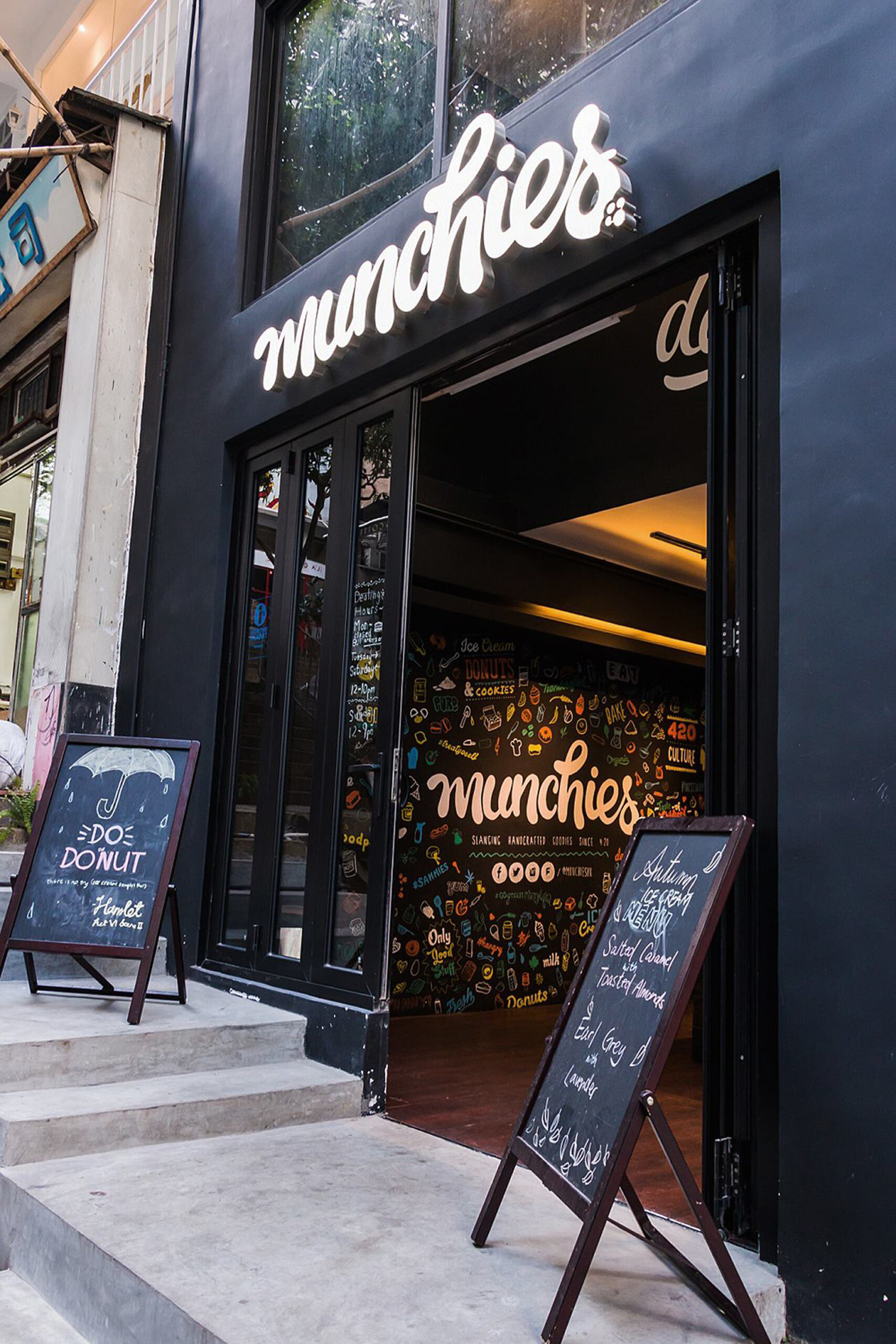
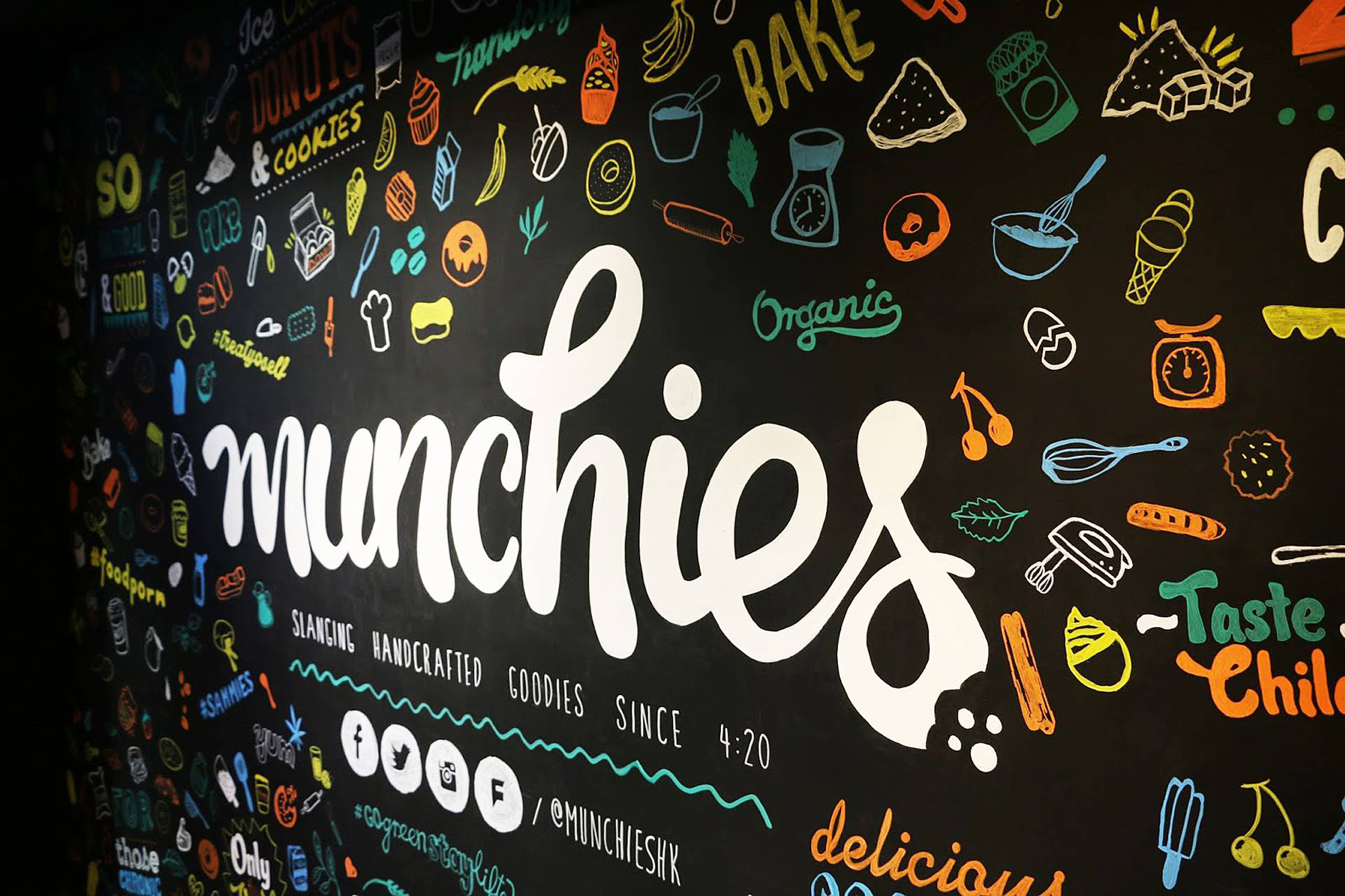
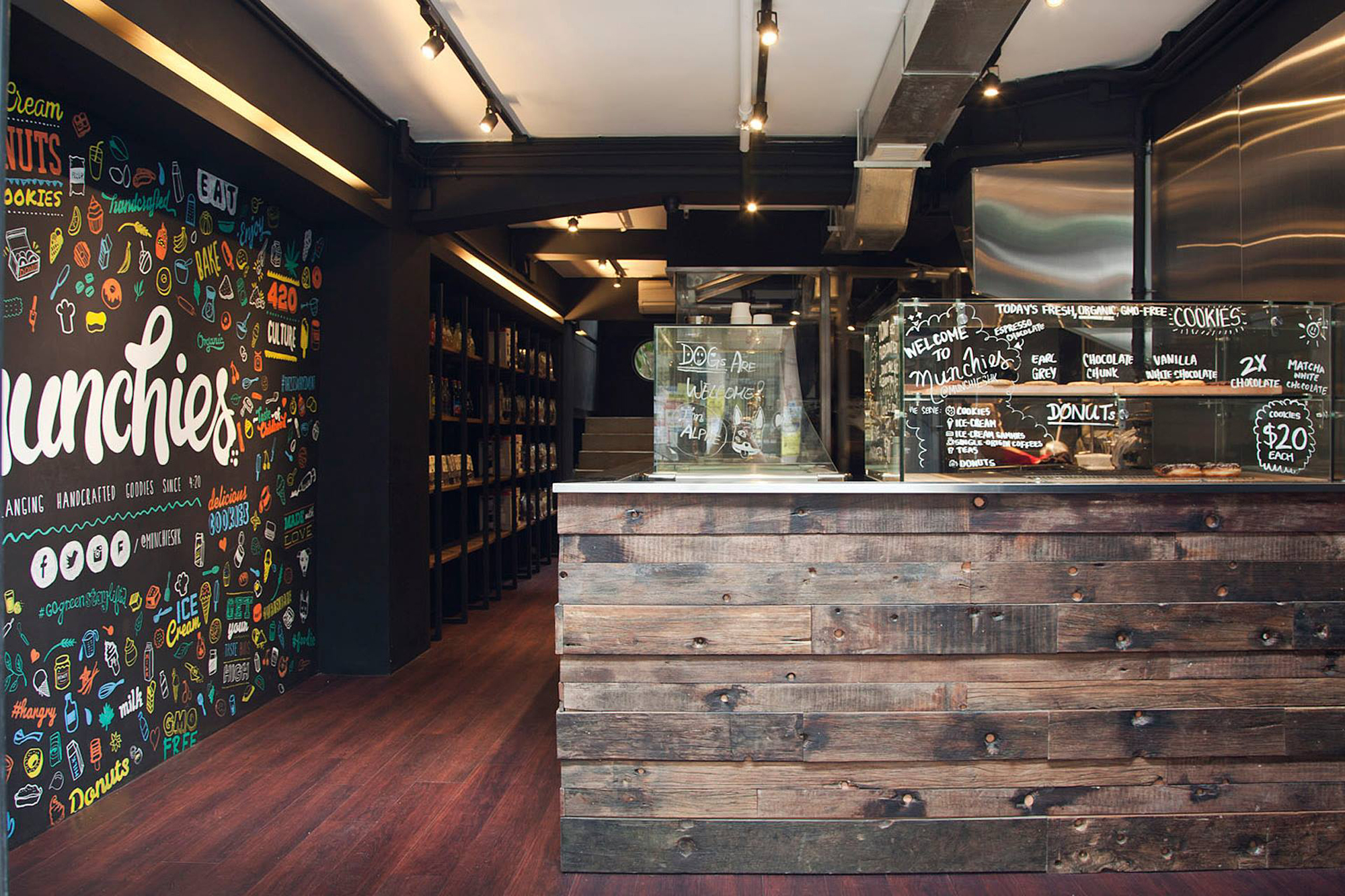
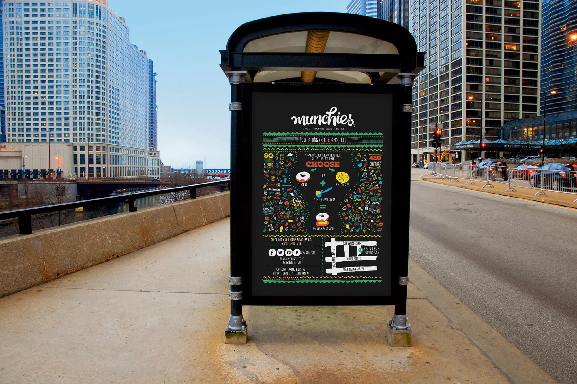
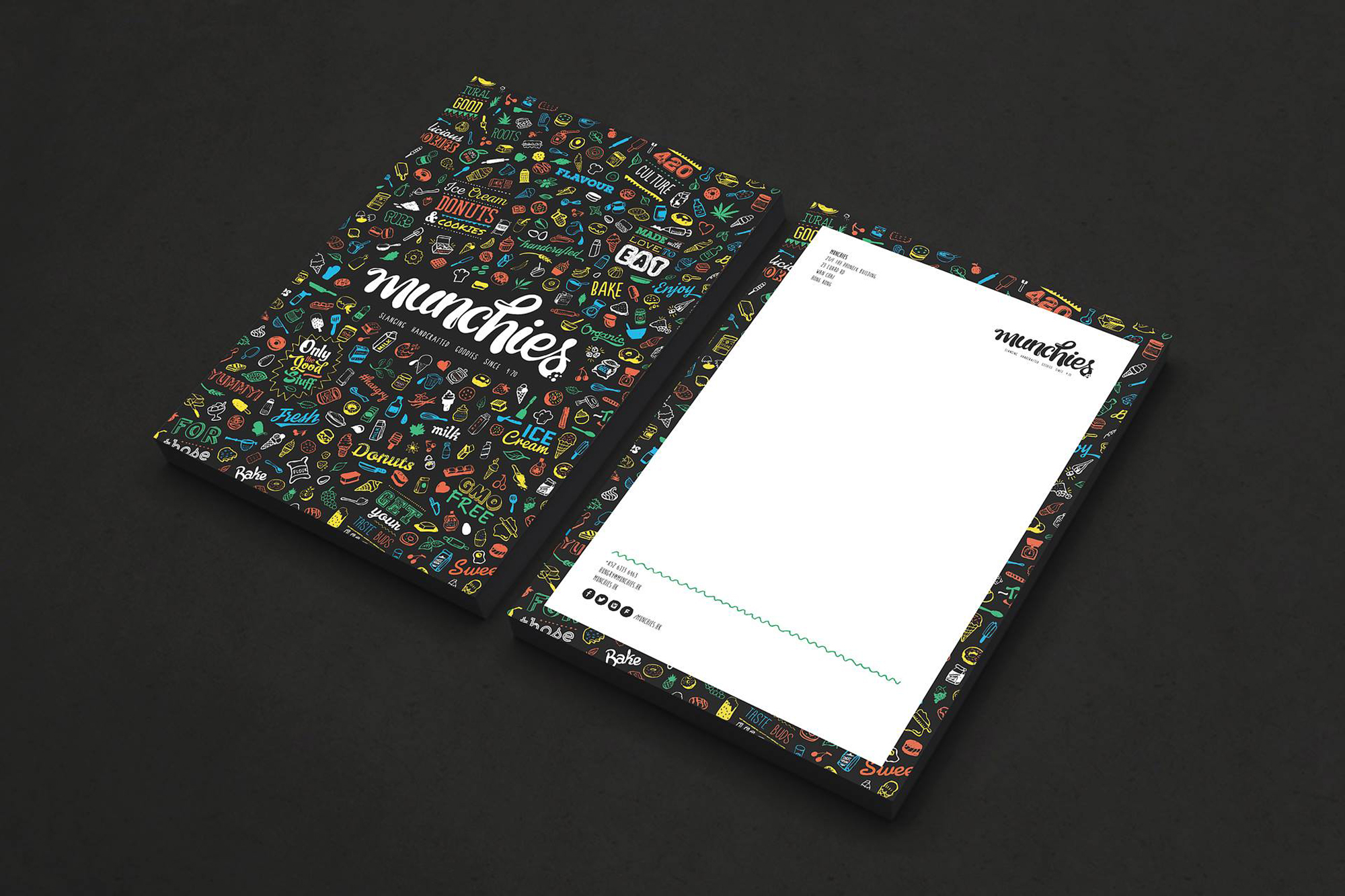
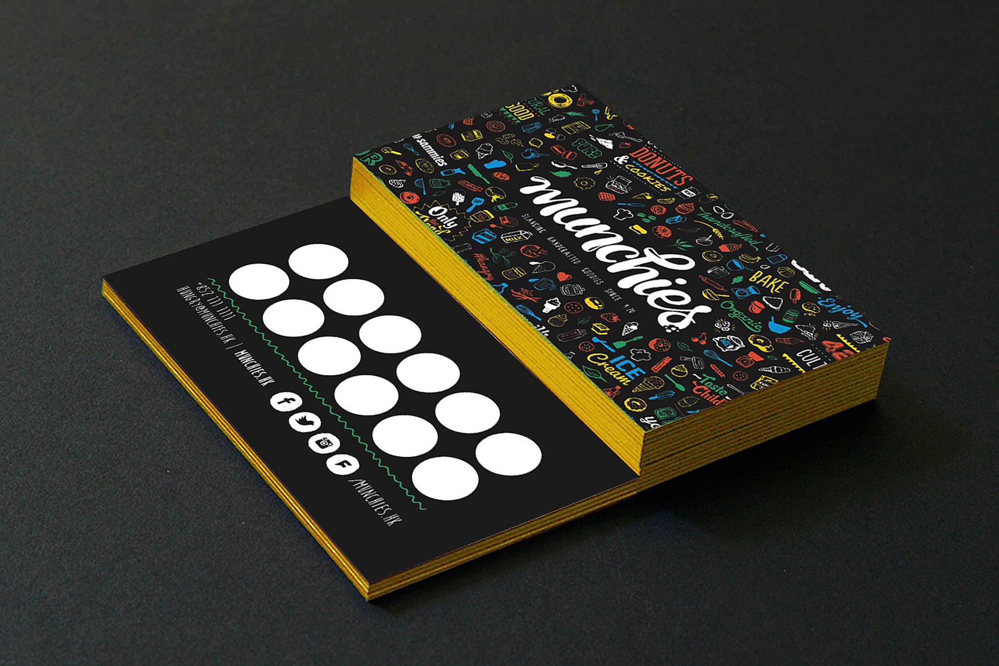
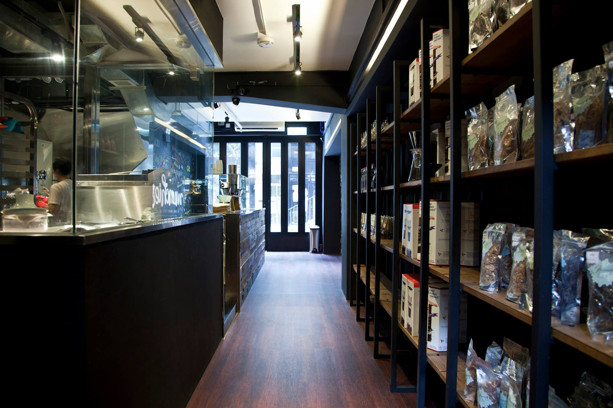
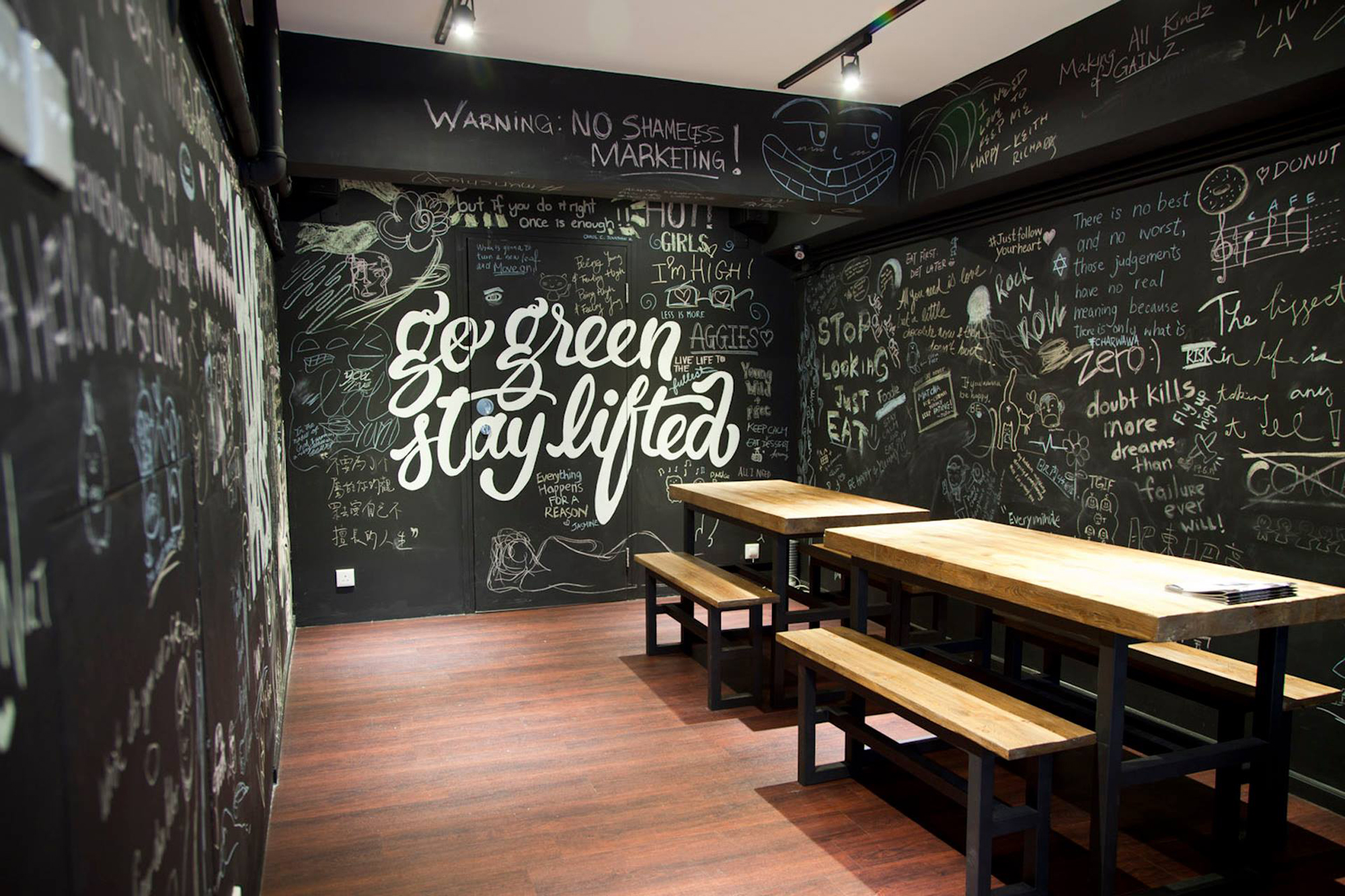
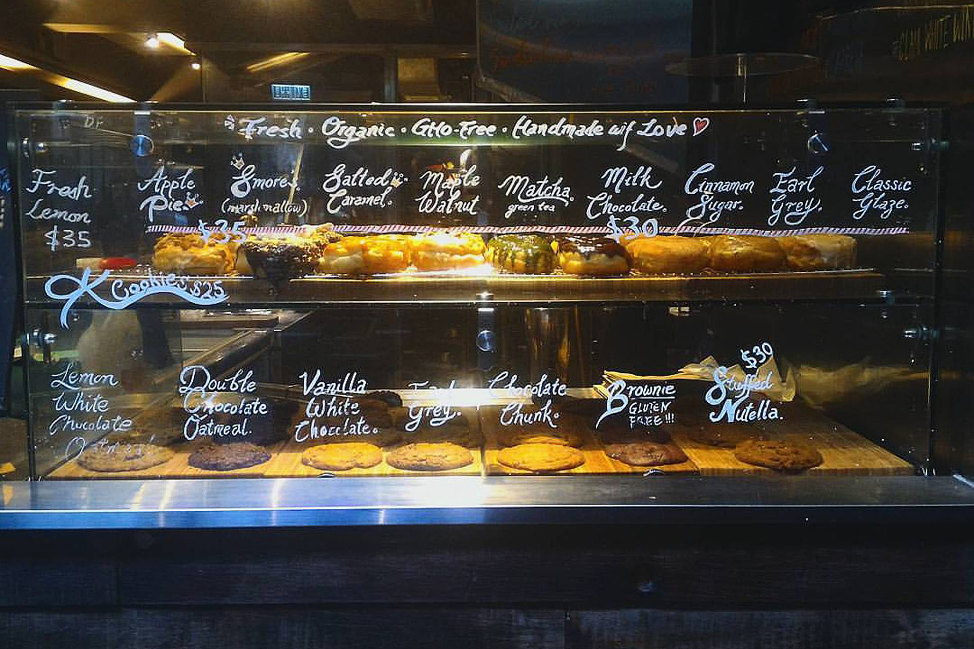
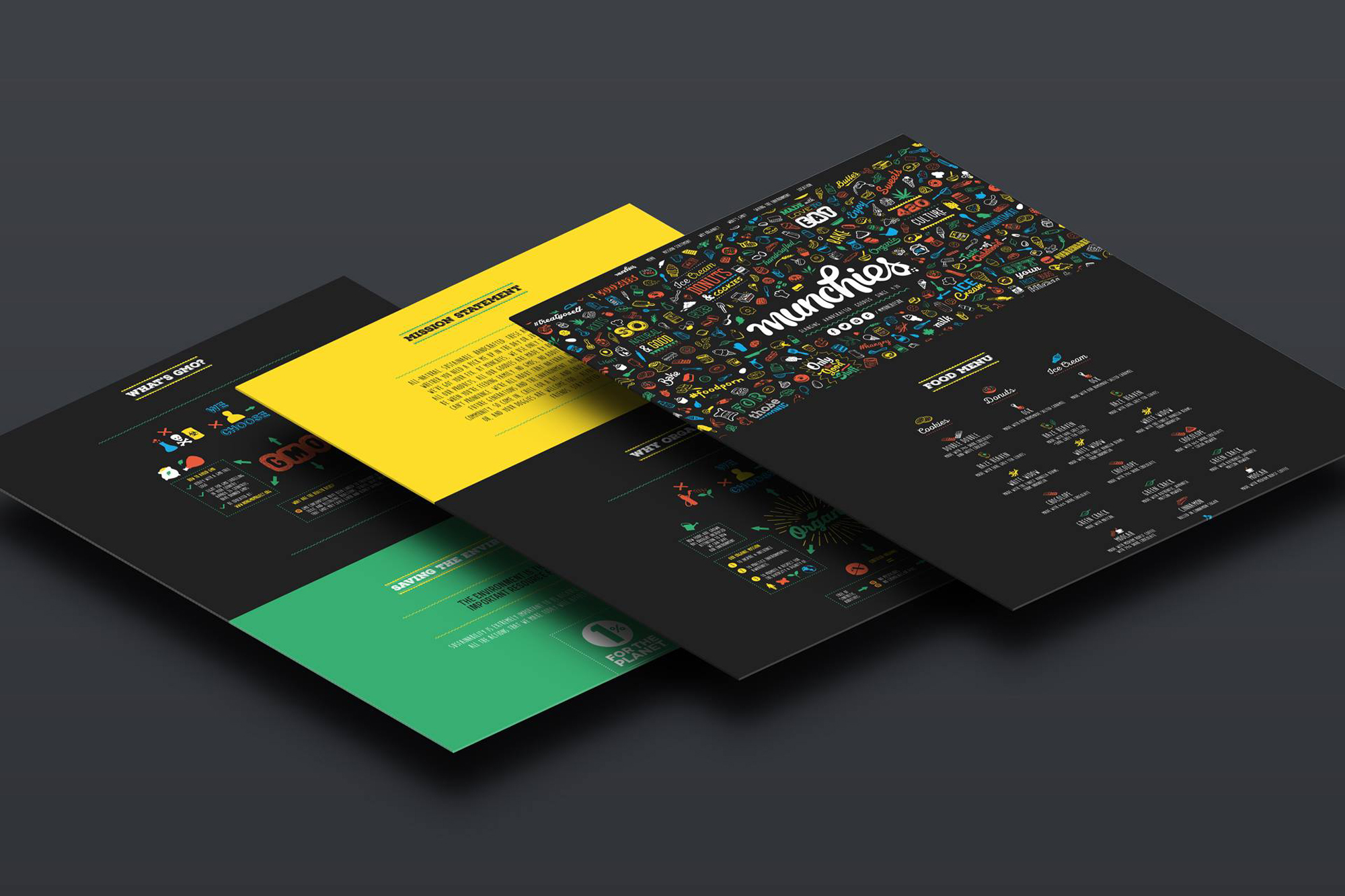
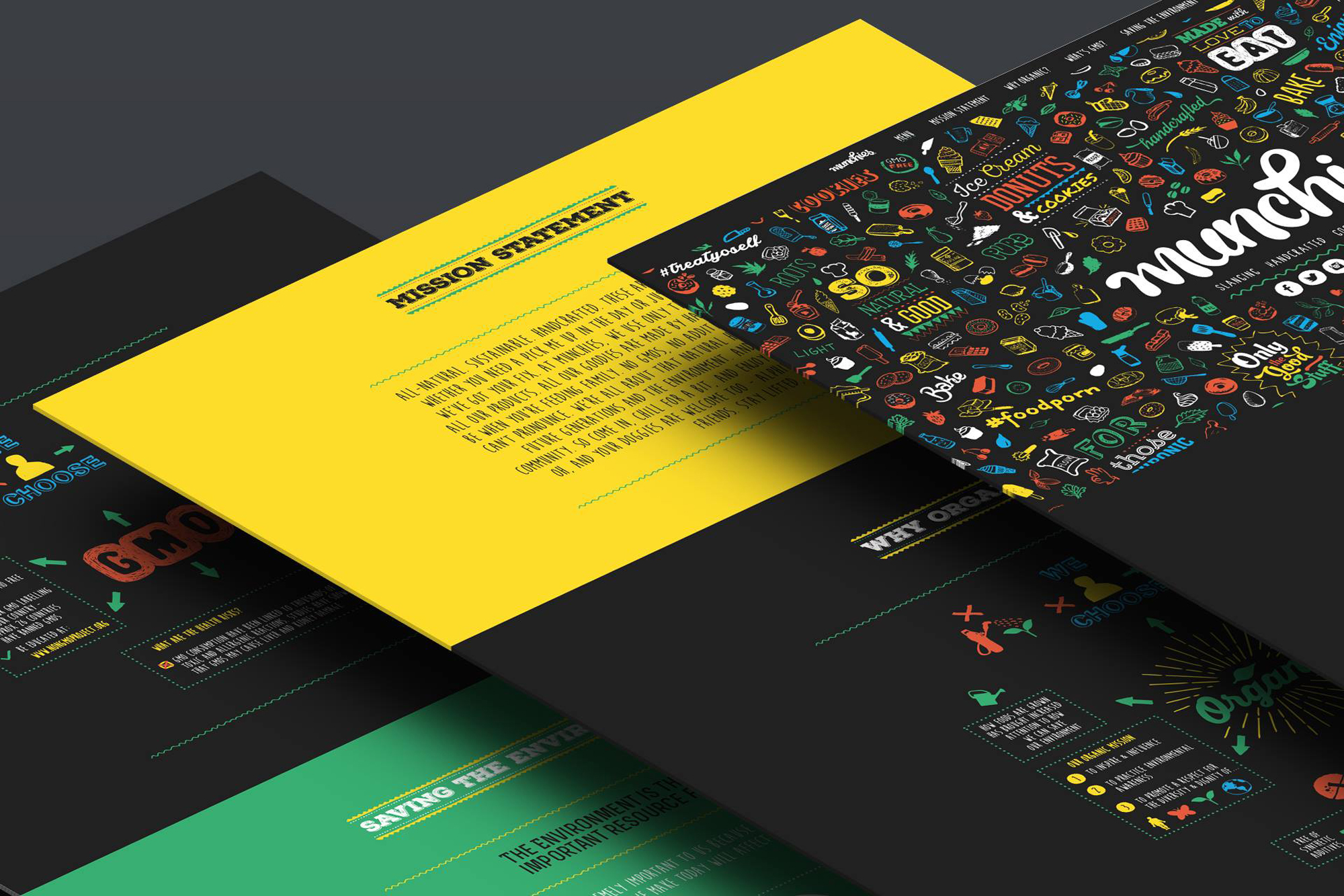
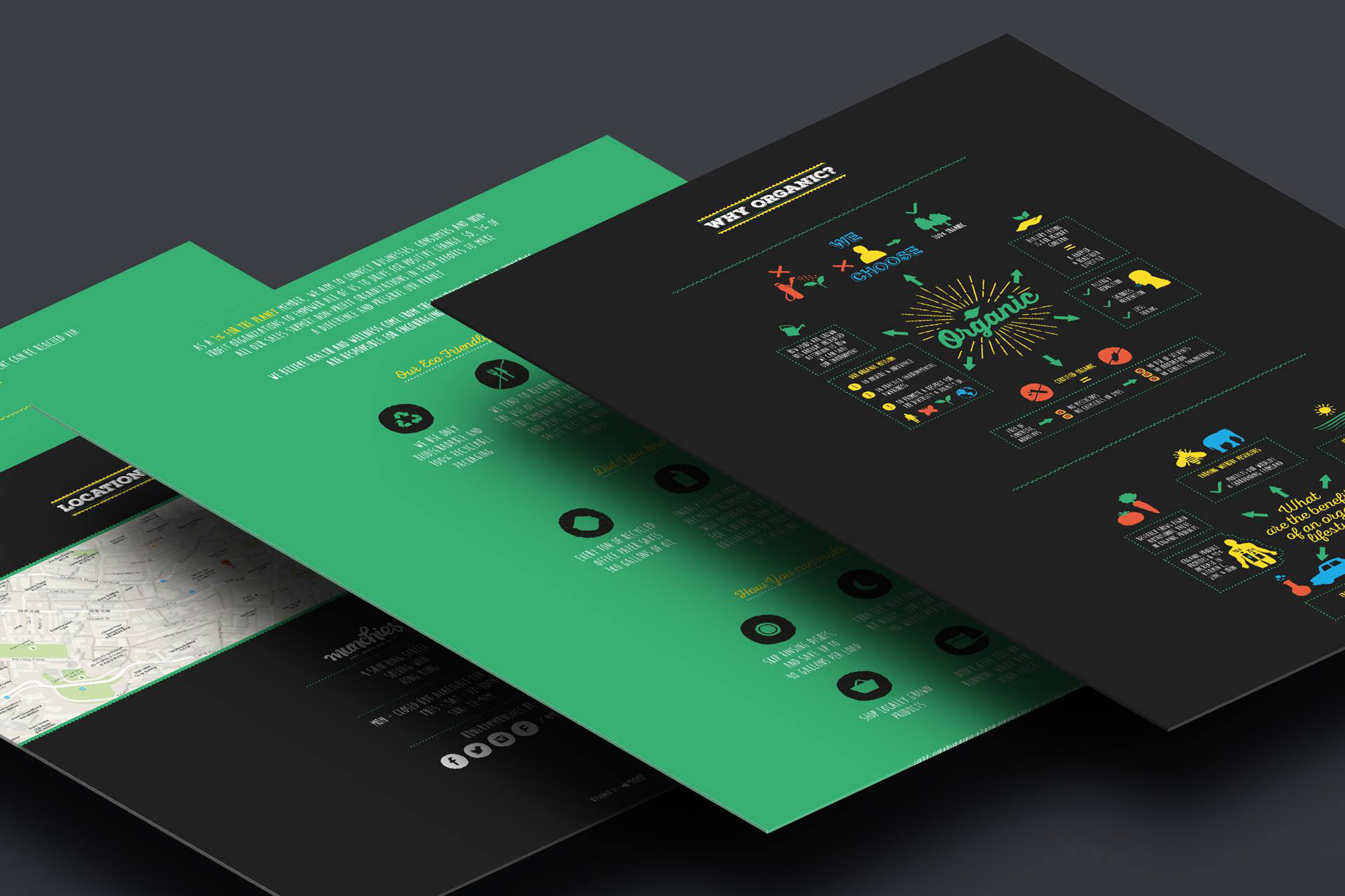
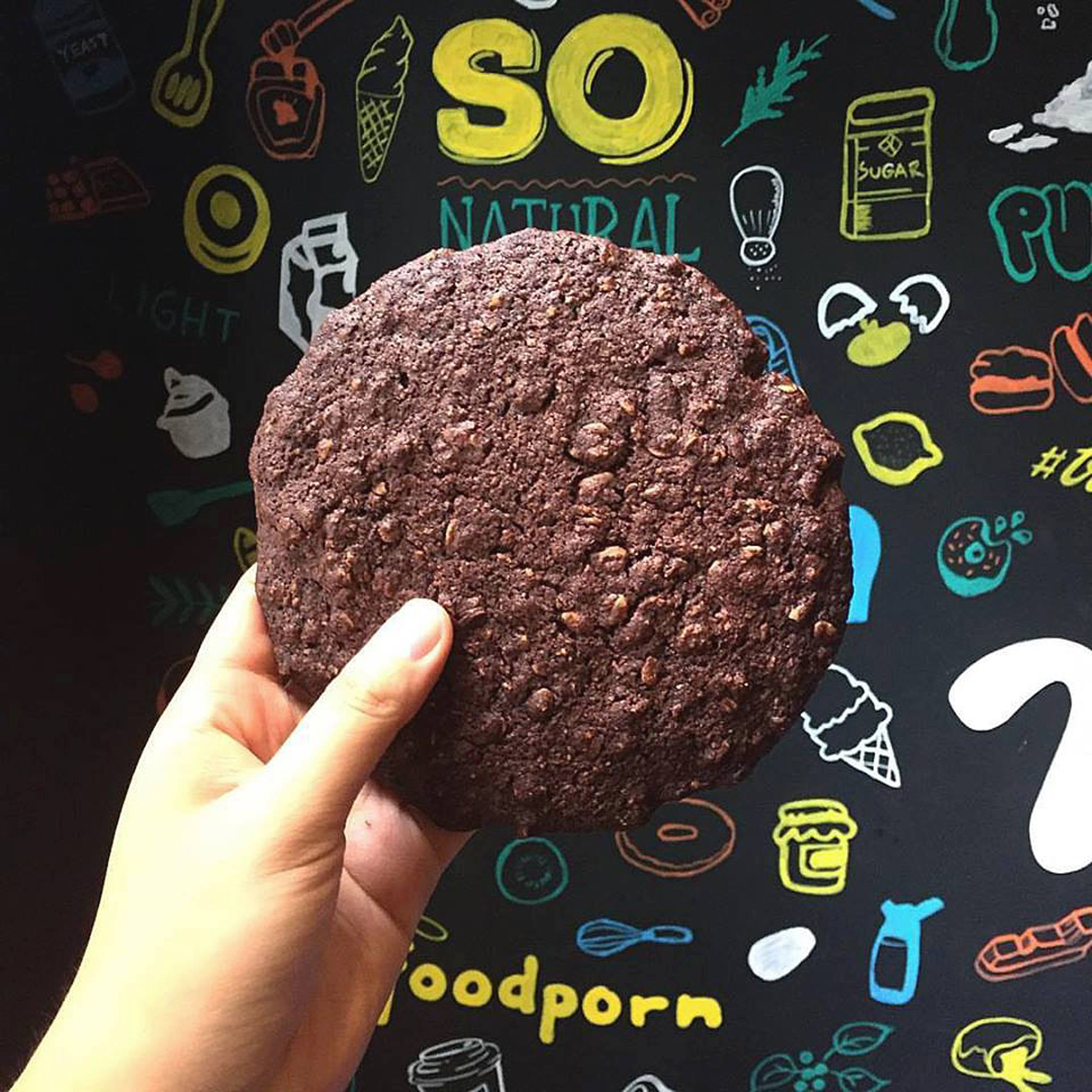
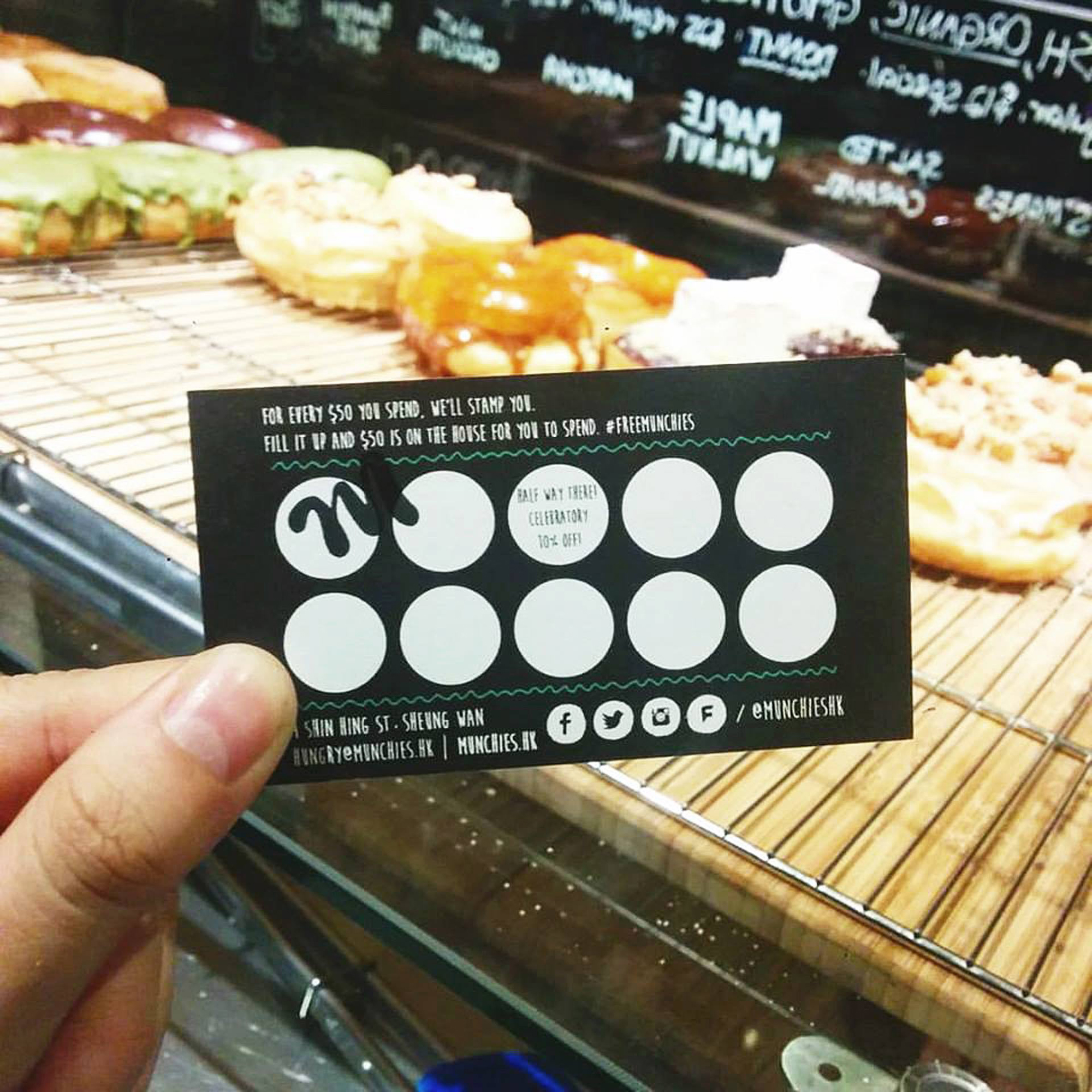
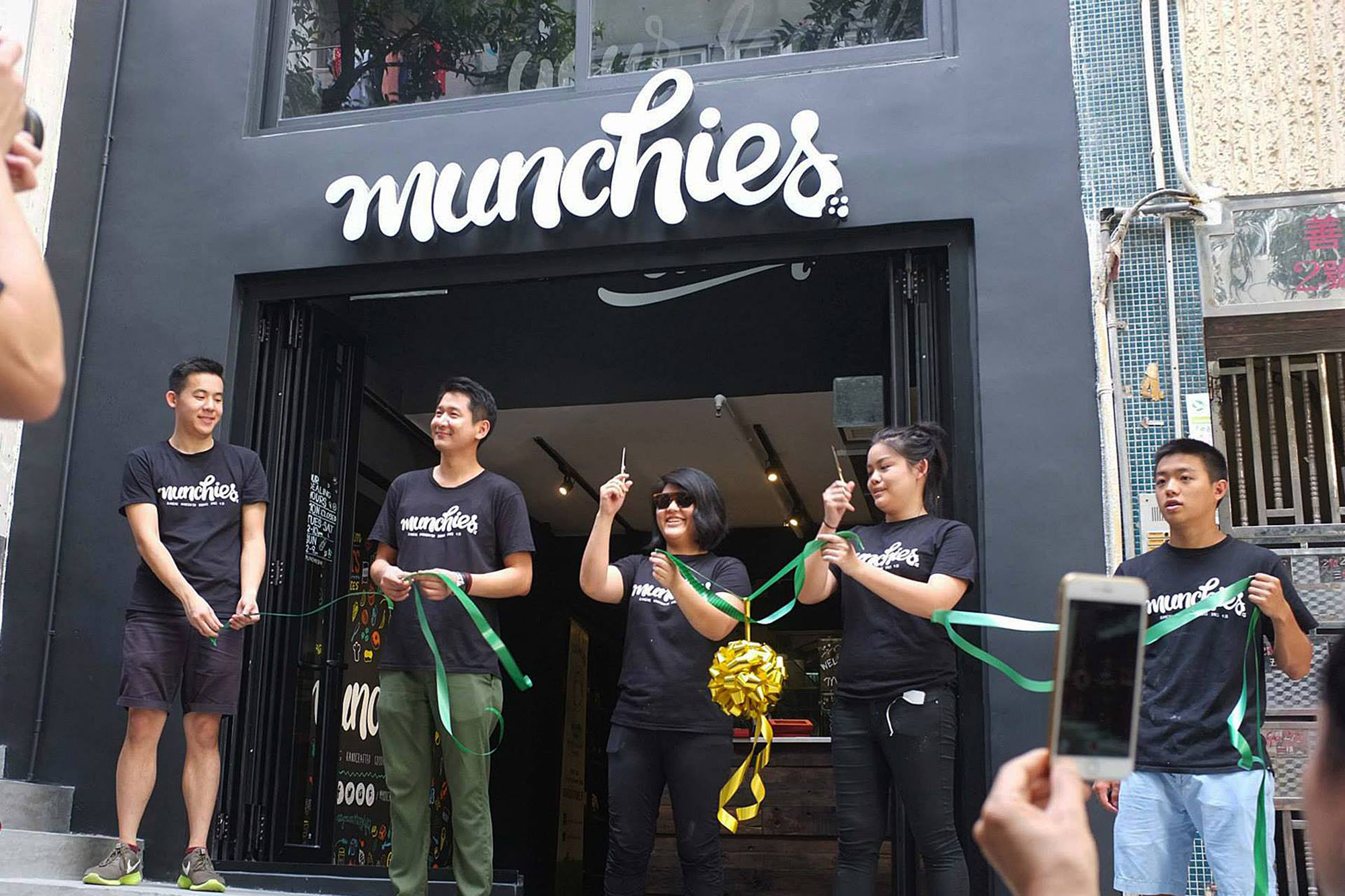
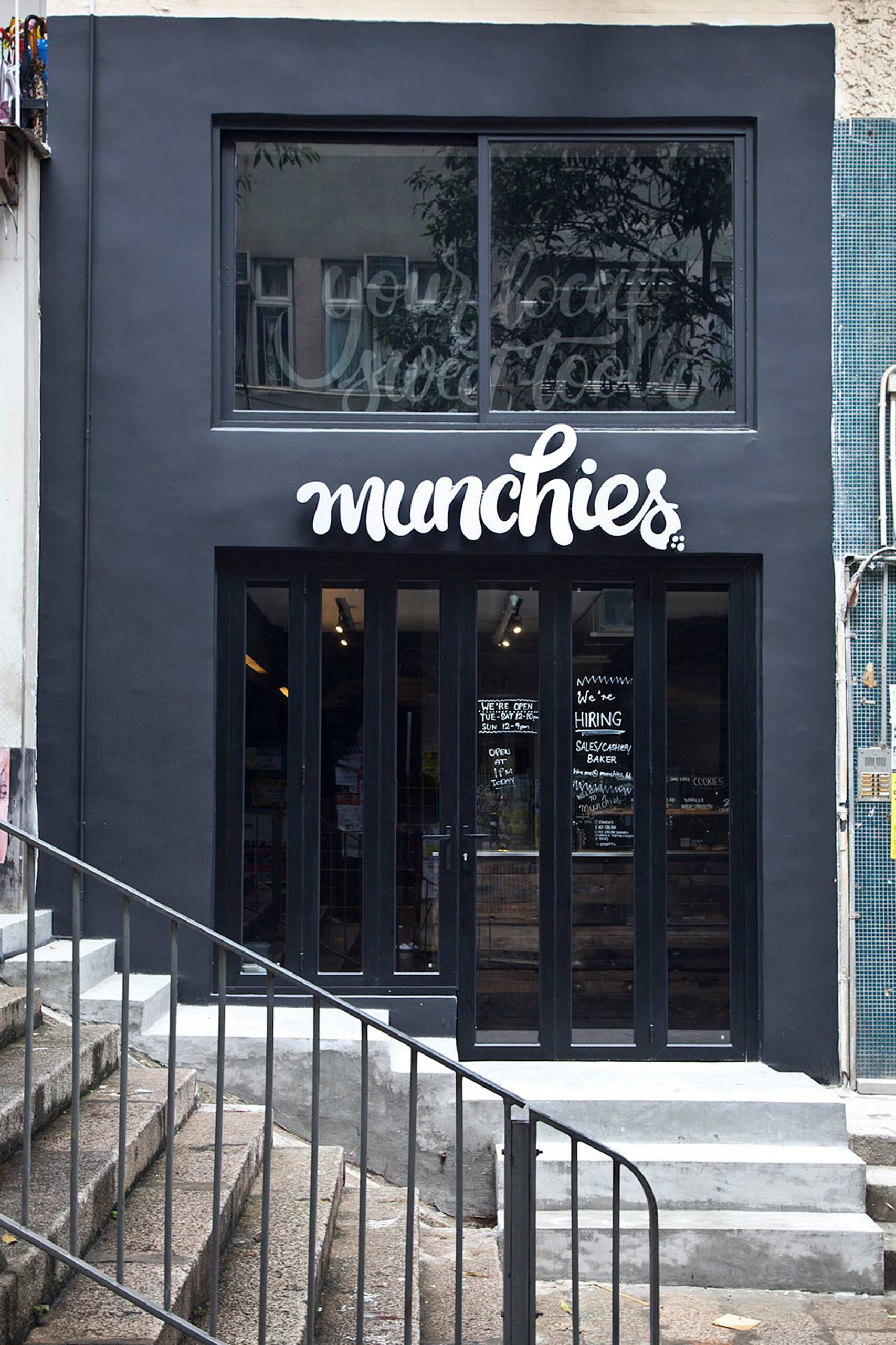
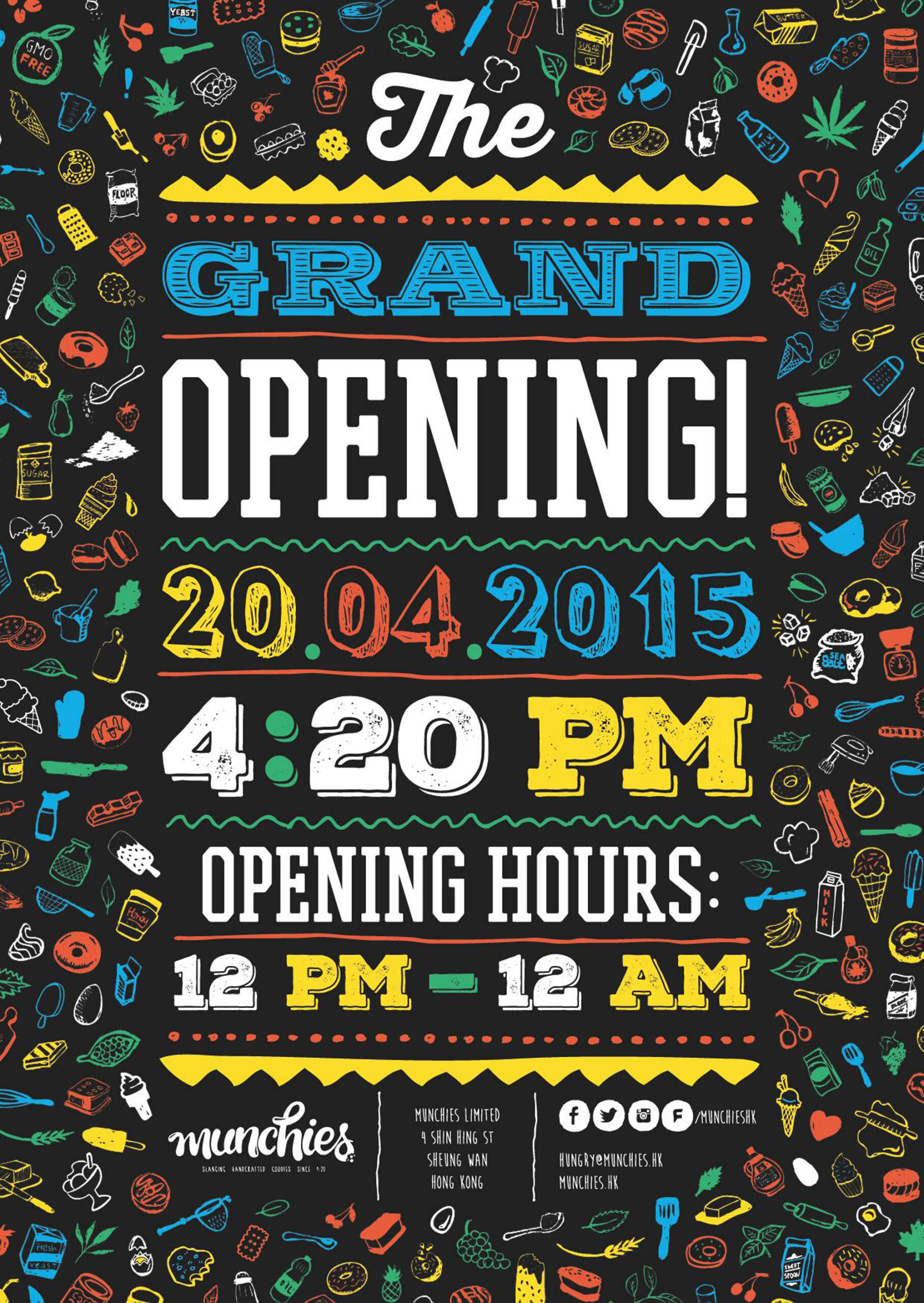
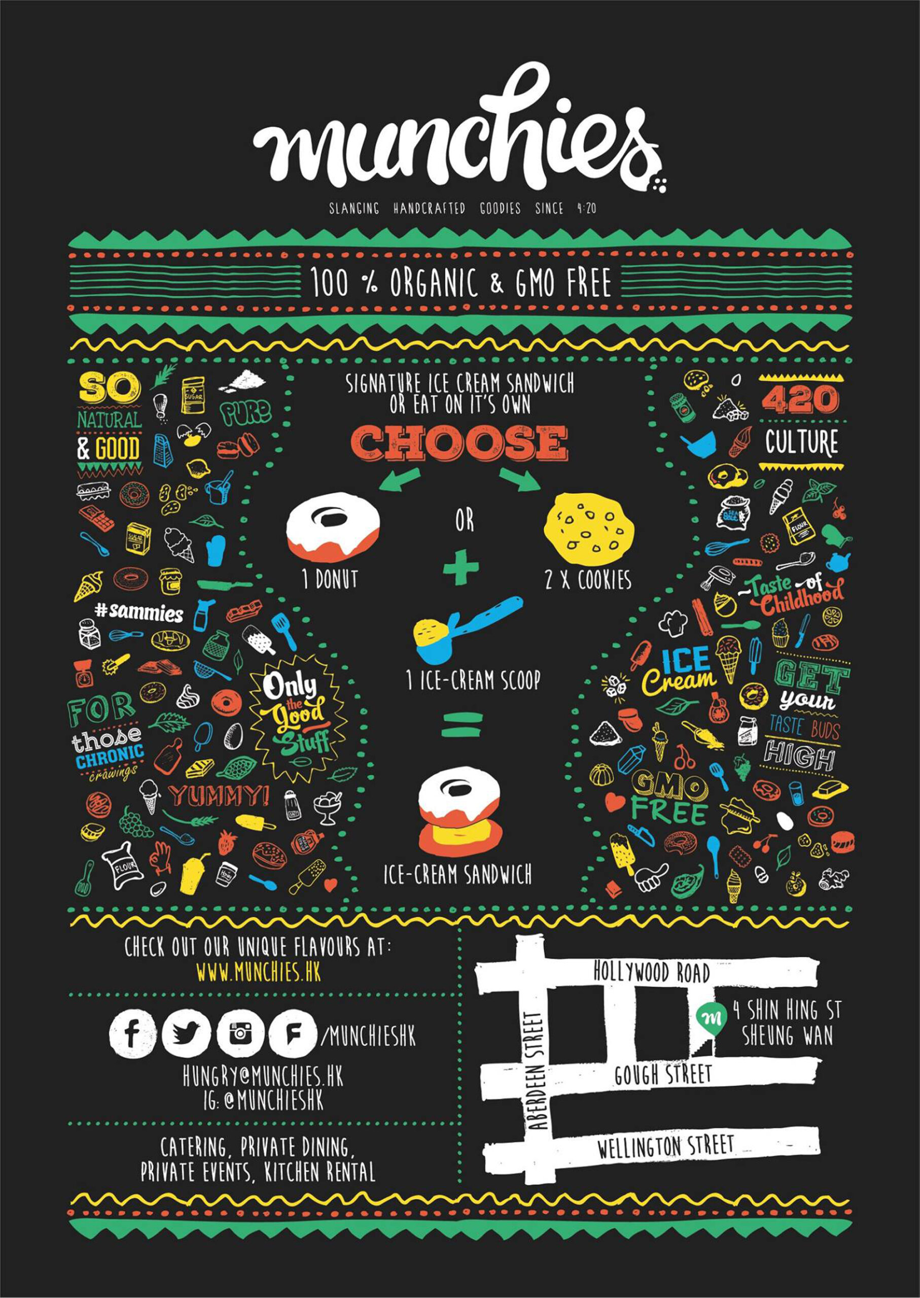
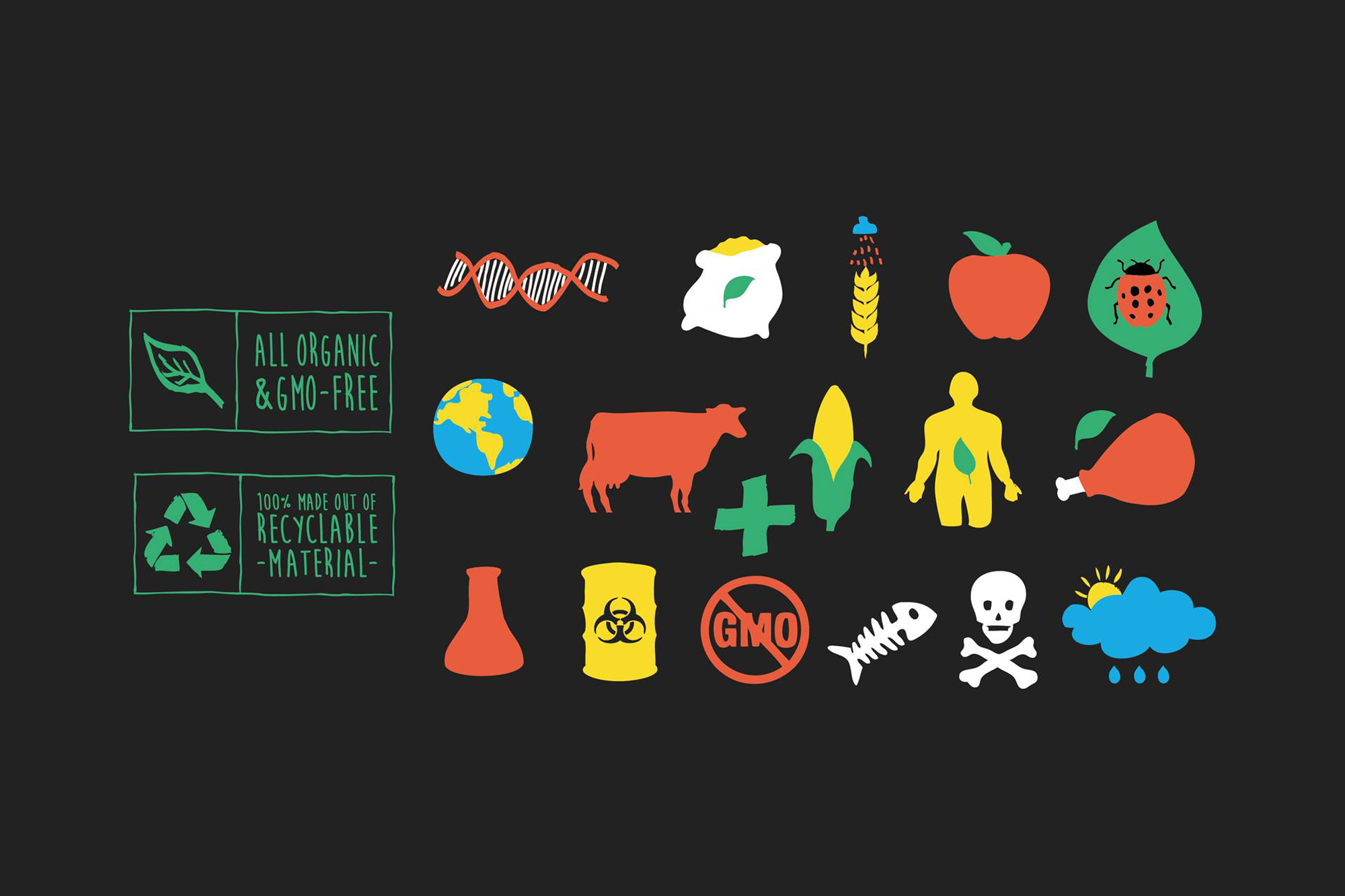
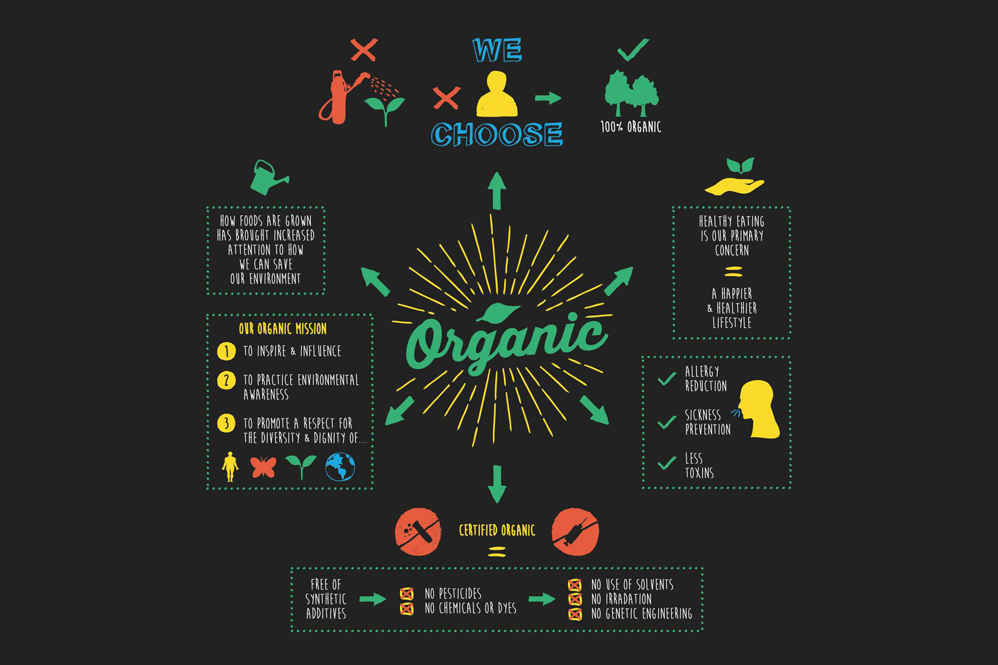
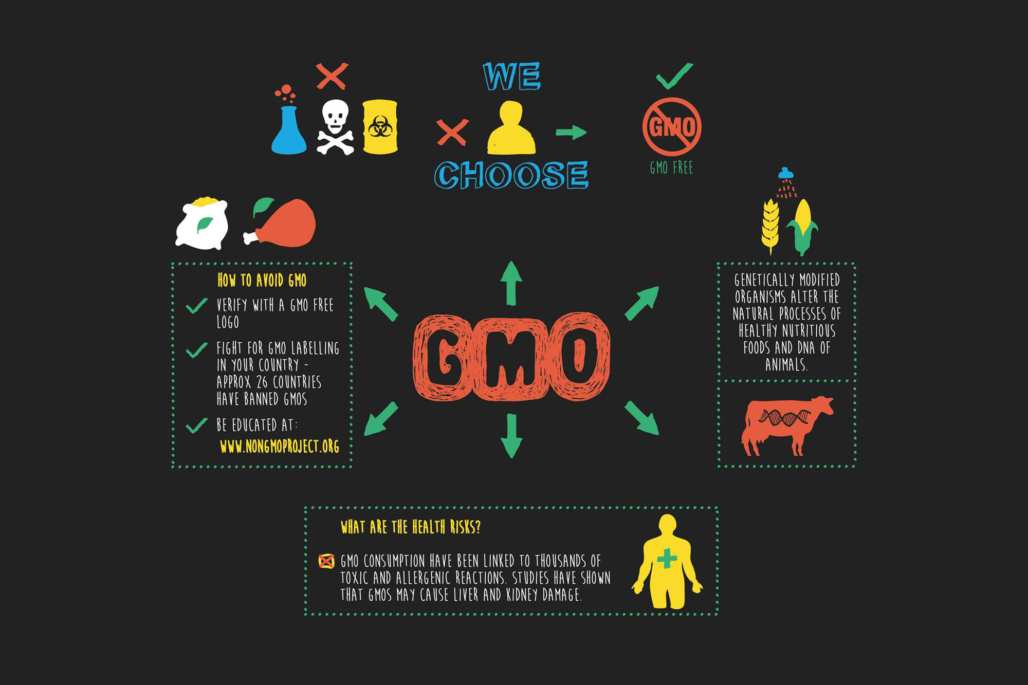
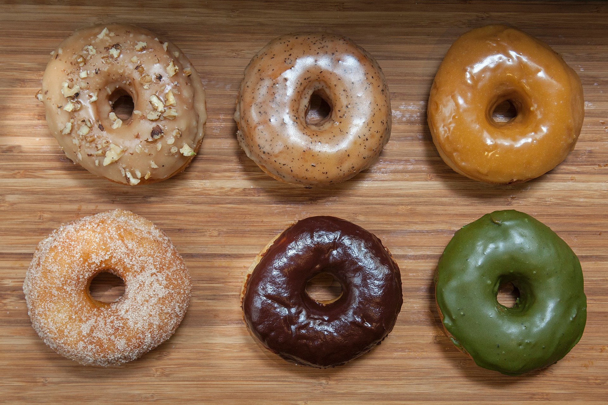
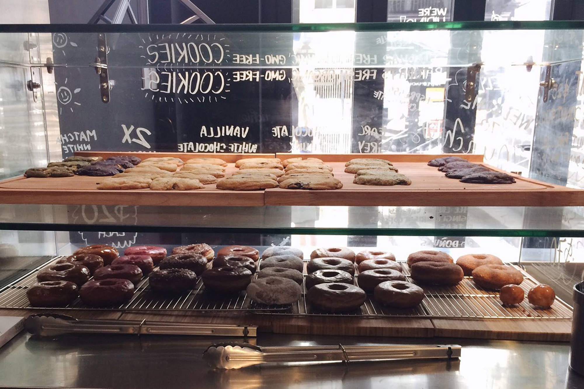
After almost a year of exotic cooperation completed a project called Munchies! Munchies is a place located in the heart of Hong Kong, offering sweet snacks – hand-made cakes, donuts, ice cream, sandwiches and ice, serving delicious drinks. Munchies overriding idea is to care for the highest quality ingredients, free of preservatives, GMO and from local small manufacturers. The whole branding and interior premises were maintained in the style of handmade combined with organic colors, having a close relationship with the aforementioned assumptions ideological and Wu xing (traditional Chinese philosophy the five building blocks of the universe). So we have 5 symbolic colors: green – nature, wood, blue – water, yellow – earth, orange – fire, white – metal, all further complemented by black. The colors reminiscent of the 4:20 Culture, which the owners really identify with. My job was to combine all these ideas into one coherent whole by developing an original, complex visual identification. It was not an easy task, because it separated us in a straight line exactly 8503 km and a difference of up to 7 zones, which to some extent hampered contact. But I think that the final result was worth it, and the same cooperation was invaluable and inspiring adventure.
CLIENT
Munchies
CATEGORY
#art
#branding
#murals
#packaging
#www
YEAR
2016